Hello fellow quilting fanatics, I'm Bethany and I'm May Queen for Stash Bee, Hive 4! When I first began quilting a few years ago I was very much drawn to a few converging corners quilts. I've always wanted to make one and have never managed to get around to it! I decided to use this bee as a chance to get a good start on one!
So, I've selected Converging Corners as my quilt block. Here's a link to a tutorial on how to do this block from Film in the Fridge.
So, I've selected Converging Corners as my quilt block. Here's a link to a tutorial on how to do this block from Film in the Fridge.
I'm requesting a wee bit of a change, mostly in block size, for my bee block but also allowing quite a few adaptations to make this a teensy bit more improv. Following the instructions from the link, I would like a block that measures 16" instead of 12.5". I'll discuss the adaptations when I get to sample blocks and such. This tutorial is excellent though and gives great instructions on constructing this block!
The colors I'm asking for are purples of all kind along with peach, coral and a teensy bit of gray. Here is the photo and color scheme that really inspired my choices.

I've also put together a pinterest inspiration board with lots of fun pictures to get you all in the color mood for this block! I adore making pinterest inspiration boards! I would like the background fabric to be a low volume print in either white or cream. Fun fact - last year I selected colors in the orange family and purple family as colors to build in my stash. They were sadly underrepresented in my stash and while remedying that, I fell in love with these colors individually and now love how nicely they play together!
Now lets talk fabric! I especially love text prints, pin dots, maps, music notes, and graphic designs in black or gray for my low volume background prints but it can certainly vary from that a bit. If you look at the low volume selection in my Fizzy quilt you can see the variety of prints and how well they work together. I'd just rather not have a low volume with a lot of color in it. (You will notice at least one low volume with aqua and brown - it's not a huge contrast so that is fine. I had another fabric in this same quilt with brown writing. It looked nice in the end. I'd rather not have a white print with lots of bright red hearts, or orange suns, etc.)
As far as the colored fabrics, I'm mostly drawn to modern prints and love Cotton + Steel, Zen Chic, Alison Glass, Denise Schmidt, Moda Grunge, Caronlyn Friedlander, Karen Lewis Textiles but as your strips will be small, please use what you think looks good. I'm not a fan of batiks or reproduction prints (at least for this quilt) so if you could leave those out that would be lovely.
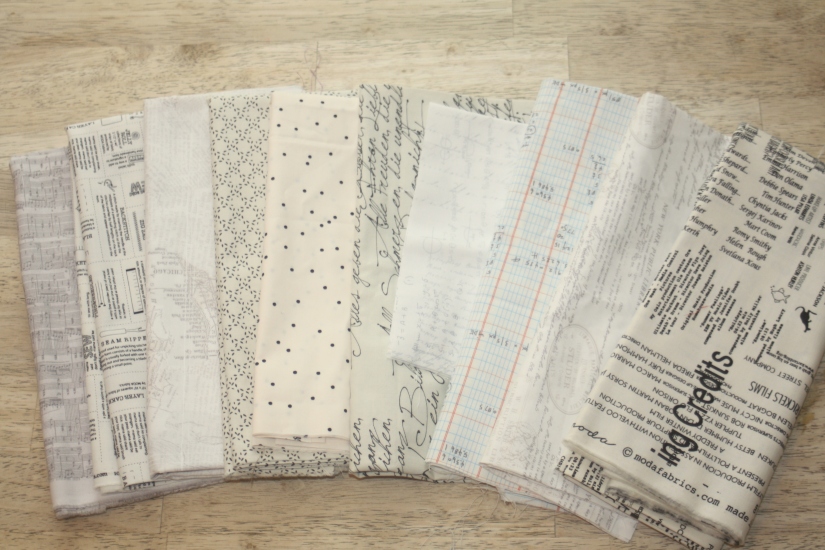
Below I'll share my fabric pull.
First the colors! I cannot think of any shade of purple that would not work for this. My range varies from pastel lavender to a dark, royal purple with everything plum and purple in between! I would like for the corals and peaches to not veer too far into the primary orange category but I know those are colors that people see differently. I promise, if you think it looks nice I will love it! I'd rather the grays (which are optional and need to be used sparingly) to be in the light to mid range. I do not want it to appear black at all. I'm good with prints and/or solids for the colored bits of this quilt!
First the colors! I cannot think of any shade of purple that would not work for this. My range varies from pastel lavender to a dark, royal purple with everything plum and purple in between! I would like for the corals and peaches to not veer too far into the primary orange category but I know those are colors that people see differently. I promise, if you think it looks nice I will love it! I'd rather the grays (which are optional and need to be used sparingly) to be in the light to mid range. I do not want it to appear black at all. I'm good with prints and/or solids for the colored bits of this quilt!
Now the low volumes! I'm such a huge fan of low volumes! I'd really rather the low volumes be a print instead of a solid. White on white prints are fine and as you see, anything with black or gray print is great (and makes me so happy!!) Once again, in the fabrics pictured I do have a low volume that has some color (the Caroline Friedlander Architexiture print) and I think it totally works!! I'm really not as picky as I sound...
Now for my sample blocks! I sometimes get carried away making sample blocks. I may have made a few...or five! I wanted you to see the variety of middles I'm cool with as well as how it all looks in repeat!
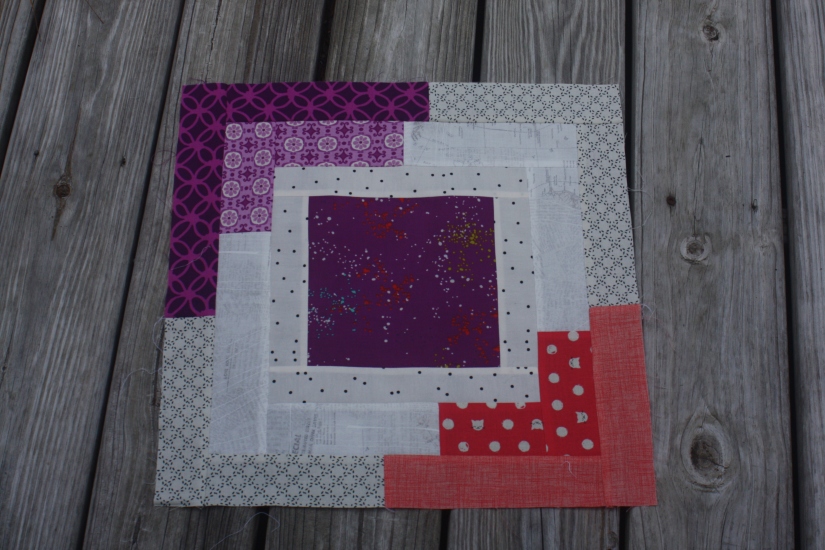
Block one -
I used a combination of wider and skinnier logs to frame the block. I added a tiny sliver of gray in with my purple logs. On this block I framed a coral square (2.5 inches) with a 1" purple frame. This is not necessary and I'll have other centers to show you other options in a bit. I just wanted you to know you could play around with the centers as far as design and size! I would like all coral/peach strips to be in one corner and all purple (with occasional gray) in the opposite corner. Logs can vary from 1" all the way up to 3". Center blocks can be any size you like - just make sure you leave enough room to have some logs with colors in the corner!
Block two -
You can see I began with a much larger, single fabric square in the center. I believe it was 8". I also used larger logs for the strips so this block went together much faster than the others. Totally feel free to do this if you are pressed for time or making more than one block and want to do a quick one!
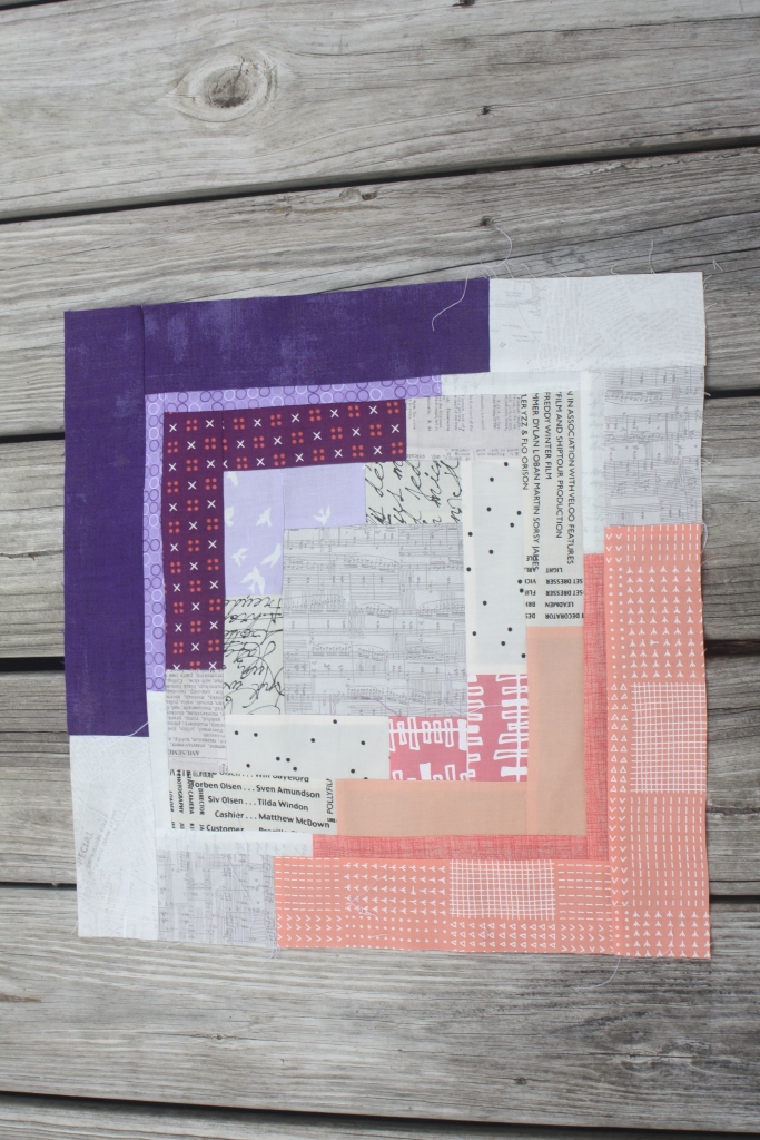
Block three -
Here's another single fabric square but it is medium sized. I believe it is 3.5". I make a larger, low volume first row around it and a mix of smaller, larger logs with the colored ends. I also used some solids in the colored section on this block.
Block four -
For this block I totally skipped the colored center! See? These blocks can be as complicated or simple as you choose!
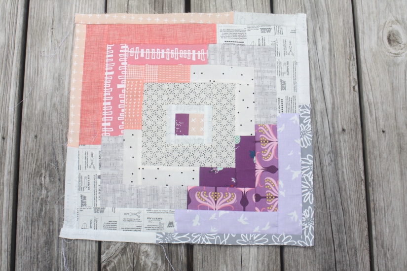
Block five -
For this block, I pieced a purple and a peach square for the center. I also added a tiny bit of gray in with the purple. I did two low volume rings around the center instead of one.
Obviously, you can see I'm good with a myriad of variations. If you want to make me a fun center, in my chosen colors, go for it. If you'd rather start with a charm square (or smaller, or larger!) of a single fabric, that is fine. If you want to skip out on a colored center all together, be my guest! I am looking forward to a variety of individual blocks that inspire you! Also, if it's easier for you to send the block a little big, I'm happy to trim it down myself!
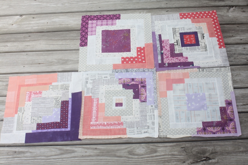
And so you see how these are coming together, here is a picture of all the blocks I have so far.
I'm still playing around with layout - I cannot decide if I want purple only or coral only circles or if I want them mixed as in this picture. I'm sure I'll enjoy playing around with it when I get your blocks in.
Thank you so much for helping me make this lovely quilt! I'm very much looking forward to your lovely blocks!
~Bethany
~Bethany




No comments:
Post a Comment